Creating custom report templates with 1st Reporting is straightforward and quick. You can use your custom report templates anytime on your mobile device. But first, let’s look at what we mean by report template because, at 1st Reporting, we can do much more than use a form on a mobile device.
What is a Report Template?
A report template is a preformatted, standardized document utilized by a person or organization to systematically document information, findings, events, inspections, and other relevant details for various purposes. It provides a consistent structure and layout to ensure accuracy, efficiency, and uniformity in reporting.
In the 1st Reporting application, you can customize any report to suit your specific needs using the template builder. Furthermore, you can dispatch these templates for your team to use in the field or a facility. Let’s review how you can create a custom report template.
How To Create A Custom Report Template With 1st Reporting (on Desktop)
What You’ll Need:
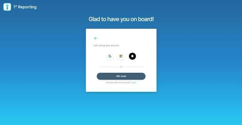
First, if you don’t have an account yet, sign up for an account. It’s free to get started, and you can even book a demo with our team, but for now, let’s move into the signup process. You can sign up on your desktop or laptop computer, tablet, or mobile device. You can easily install our app on your mobile device via Google Play or The Apple App Store.
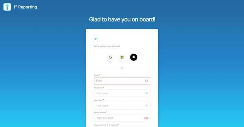
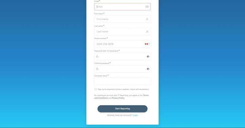
Sign up for an account and put the appropriate information in each required field.
Completing your information only takes a moment; then, you’ll be working in the app, so ensure you complete all required fields.
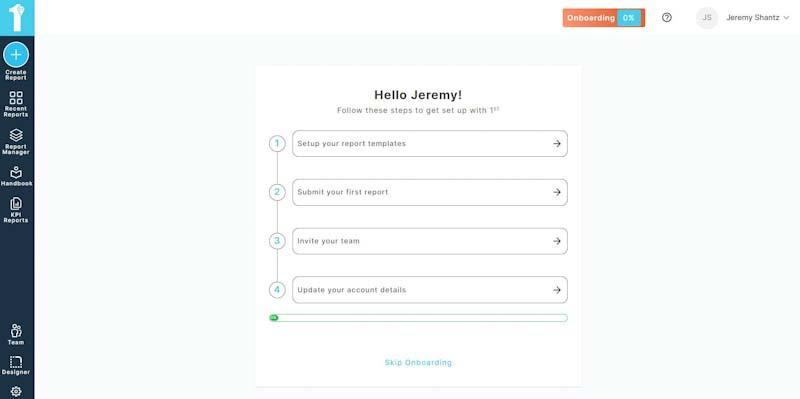
Once you complete the form, you’ll be whisked to your onboarding screen. Here, you’ll notice a handy onboarding progress bar at the top of the screen that helps you understand when you’ve completed your onboarding process. For now, we want to create a Custom Report Template, so we’ll skip some of the formalities and jump over to the Designer on the lower left of your screen.
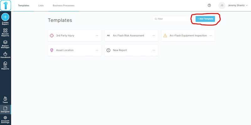
Now, we will be on the Templates management page. Here, you’ll want to click on the ‘Add Template’ blue button on the upper right of the screen. I’ve circled it roughly in red in the screenshot below.
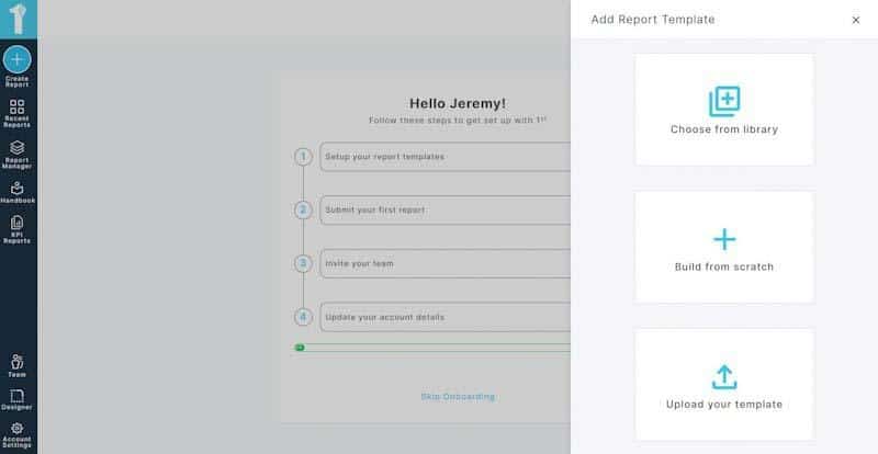
As you can see in the screenshot below, you’ll have three choices: to use a template in our prebuilt library. If this is your choice, you can modify the template to suit your needs. The third option is to upload a version of your template, and one of our template specialists will create a digital template for your needs. However, we will pick option two in today’s guide: Build from scratch.
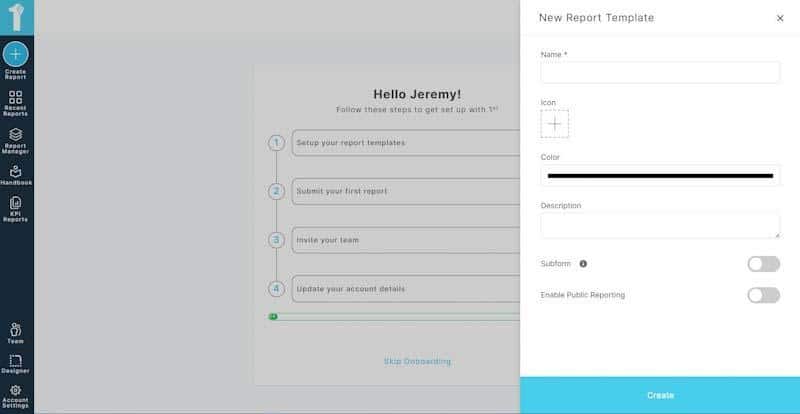
The first screen you’ll see (see screenshot below) is the New Report Template screen. Here, you can name your template, add an icon, choose the icon color, and add a description of your form. Furthermore, you can also create a Subform or enable Public Reporting features. However, we’ll stick to a standard custom template to get things moving.
So, give your template a name, choose an icon and icon color, and include a description of the template for your team so they understand the template’s intended use. Once you’ve included the basic information, click the big blue Create button on the bottom right of the screen.
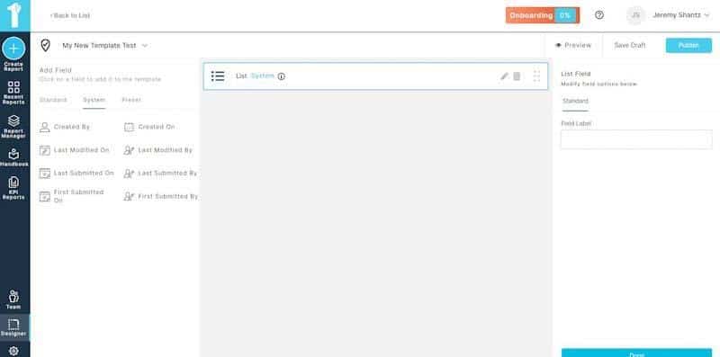
After you’ve created the template, you’ll see the screen below with a large empty box prompting you to add fields. Fields are on the left in three sections: Standard, System, and Preset. Let’s take a look at each while we make a custom template:
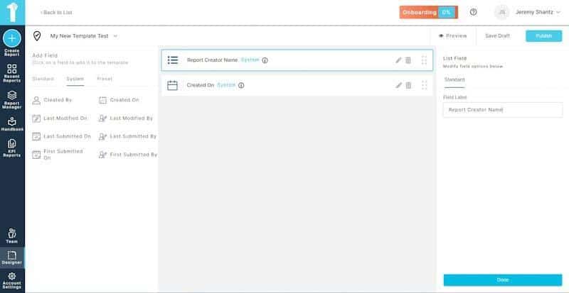
We’ll start with System fields in the expansive and white vertical menu on the left, under the center tab. For example, we’ll choose ‘Created By,’ and a List pops up when we do. The system generates a list of users in your account, so it can match the user completing the report, form, or another document you create to the form data as the user who created the report. It will automatically choose the person logged into the account and auto-complete the user field with their username. You must name the field, like ‘Created By’ or something similar, and the app does the rest.
Let’s say you want to automatically have the app insert the date, time, and username of the person completing a report. Again, we’ll look to the system fields for ‘Created On.’ This field will act similarly to the name field, except it merely generates the date and time the report was created. Again, you only need to name the field to your preference.
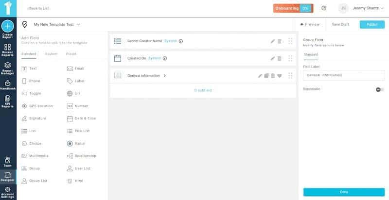
Jumping over to the first field tab now, let’s look at a few of the standard fields you can add. You’ll notice in the screenshot below that we have multiple fields. In the image below, I’ve created a group field. You’ll notice it says 0 subfields, as it’s only acting as an empty file folder where we can add other fields. This feature is great when you want to group data.
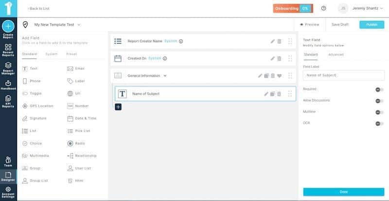
As you can see in the image below, when we click on the group we’ve named ‘General Information,’ a new white plus symbol appears with a dark background. We can add fields to the group by clicking on this plus symbol.
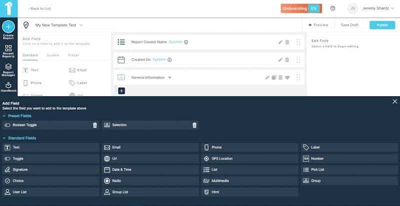
When you click on the plus symbol for a group, a new window opens on the bottom half of the screen, as you can see in the screenshot below. You will again have multiple field options to choose from.
For the example in the following screenshot, I’ve chosen to create a text name field. I named the field and clicked on the ‘Done’ button on the bottom right. Keep in mind that you’ll also have multiple options for fields; here’s a brief description of each:
Required—This selector controls whether the user can submit the form with or without completing the field. If you turn it on, the user must complete the field, or they cannot submit the form.
Allow Discussions – The ‘Allow Discussions’ selector will turn on or off the ability for users to make comments on a specific field.
Multiline – When you expect a paragraph or more of text, you’ll want to select ‘Multiline.’ Turning it on allows for longer text inputs across multiple rows. Keeping it off will limit character input.
OCR—Optical Character Recognition is a technology that enables a user to scan a document with their device. The software automatically turns recognizable characters into text.
Moving along, I’ve chosen to add an email field next to the group. As you can see in the image below, each field has its own set of options that you can use to customize how your team experiences their forms.
You can add any of the fields you like within a group or outside of a group. As you can see in the screenshot below, I’ve added a Phone field, which I’ve named Contact Phone Number for the sake of this tutorial.
Below you can see that I’ve added a simple list outside the General Information group I was working in. When you exit a group in the creator, you’ll use the menu on the left to select the field you want. In the list field I’ve chosen, you can see that we have the same and other field selectors again, one of which is to use a Global or Local list. The global list allows you to select one of many predetermined list field types, such as ‘yes, no, and n/a.’ If you want to create custom list options, then you should select the local list option.
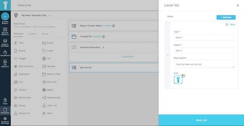
In the below example, I’ve selected the local list to create some custom items. When you select the local list, you’ll notice a dark pencil and pad icon appear to the right of the local list selector. Click on it to see the item creator screen.
As you can see in the screenshot below, the items creator is simple; click on the Add item blue button.
Add your custom items. Just fill in the text, and the value will automatically populate. You can also add a description and even an icon if you like. I’ve added the 1st Reporting logo as the icon in the screenshot below. This feature is great for making custom lists that stand out and help your team complete their inputs faster. When you’re done making your list, click the big blue Save List button on the bottom right.
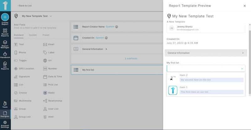
While working on your custom template, you might want to see what it looks like to a user. To do so, click the preview button on the upper right (beside the Save Draft and Publish button). In the screenshot below, you can see our example template, complete with list icons. Notice how the grouped items are ‘shrunk’ inside the custom group tab I named General Information.
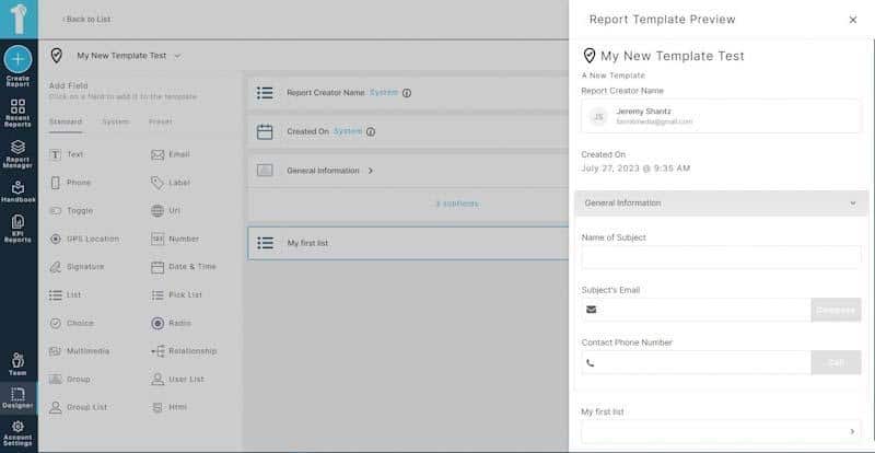
When a user clicks on the group tab, in this case, ‘General Information,’ the fields you created inside the group appear for the user to complete, as you can see in the screenshot below.
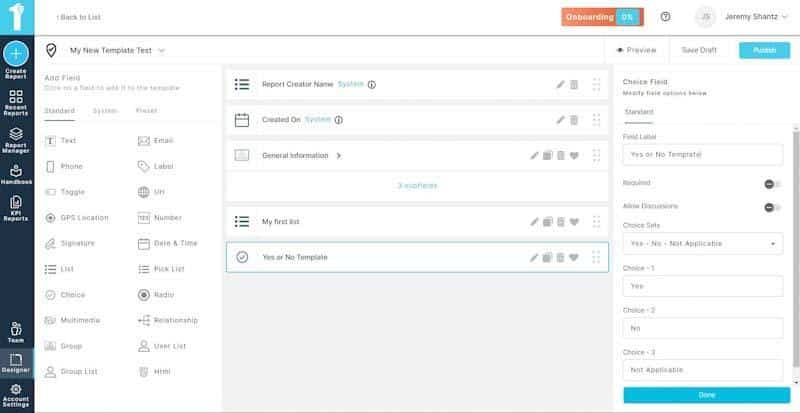
Adding more fields is easy; you can add fields until you’re satisfied with all the information you need to gather on your report template. For example, in the screenshot below, I’ve added yet another field, this time checkboxes or check circles.
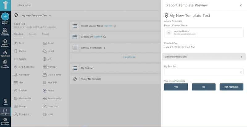
With a selector like the ‘yes/no’ checkboxes we chose in the builder, it appears as nicely formatted buttons on the user end, making data input fast and efficient for the end-user personnel completing reports in the field.
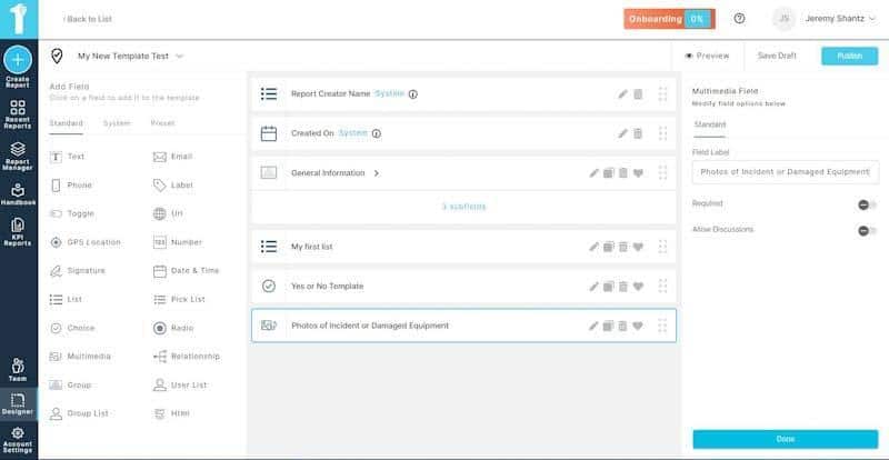
You can even add multimedia fields so your teams can input images, photos, and videos right from their device. This feature is great for getting the actual picture of what’s going on out in the field. Your team can take pictures of damage, hazards, and valuable media for your report.
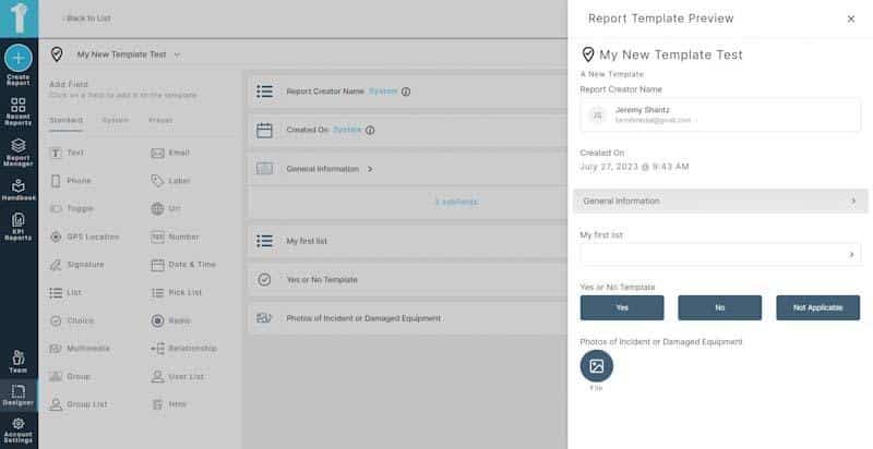
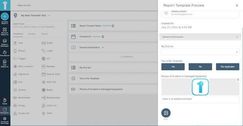
Your team will see a field to easily upload their multimedia to their reports, as shown in the screenshot below.
For the sake of the example, I’ve uploaded the 1st Reporting logo to a report. Your team can do the same for any incidents, inspections, or other purposes as long as their template has the appropriate field, as I’ve added in our example.
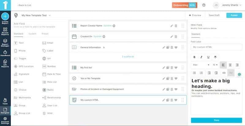
One of the other great features of the 1st Reporting app is its versatility. You can create forms with formatted text to include instructions, tips, or other data built into the form. See below.
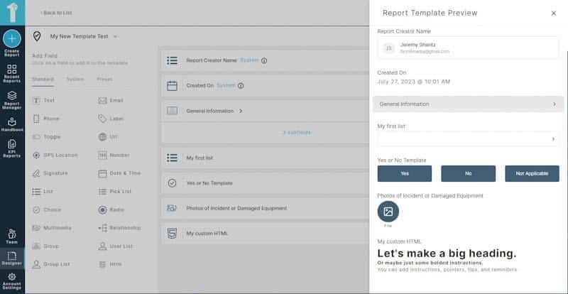
The user will see the HTML as you have formatted it. Take a look at the preview of this example in the screenshot below.
When you’re done creating your template, you can save it to draft so it will only appear to you and no one else, or if you’re ready to deploy it, you can hit the Publish button. When you do, the template will become available in the library for your entire team unless you specify otherwise.
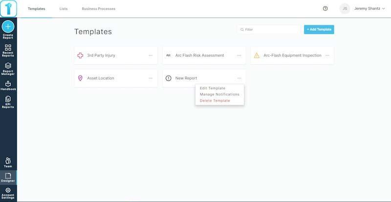
Notice in the screenshot below how my ‘New Report’ is showing in my usable templates. There are three dots on the right side of each template. Choosing my ‘New Report,’ let’s look at setting up a custom notification for our new custom template. We’ll go ahead and select ‘Manage Notifications.’
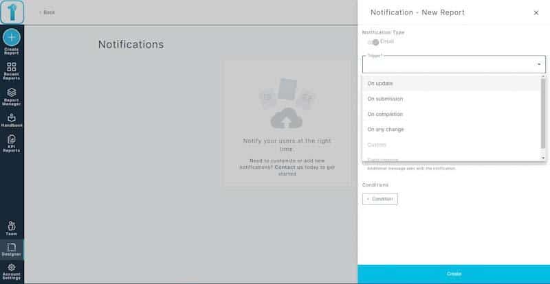
Another great feature of having customization controls in 1st Reporting is the ability to create a custom notification that triggers automatically. To start, click on the Add Notification button on the upper right.
See the screenshot below. I’ve opened the notification window and am proceeding to choose the trigger conditions I want to trigger the automatic notification.
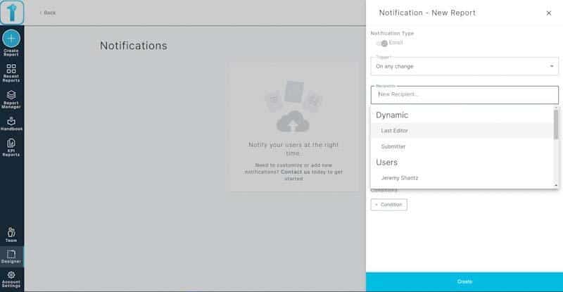
Next, I’ll select the recipient I want the notification to go to; as you can see in the screenshot below, we have both static and dynamic options to choose from.
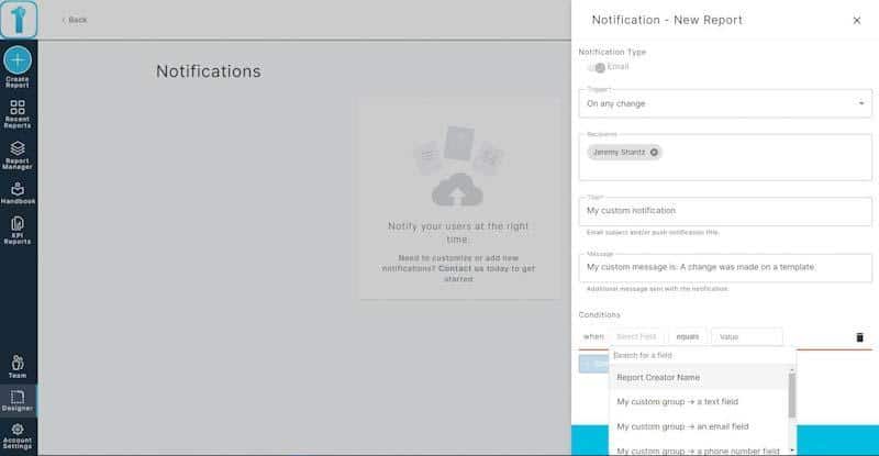
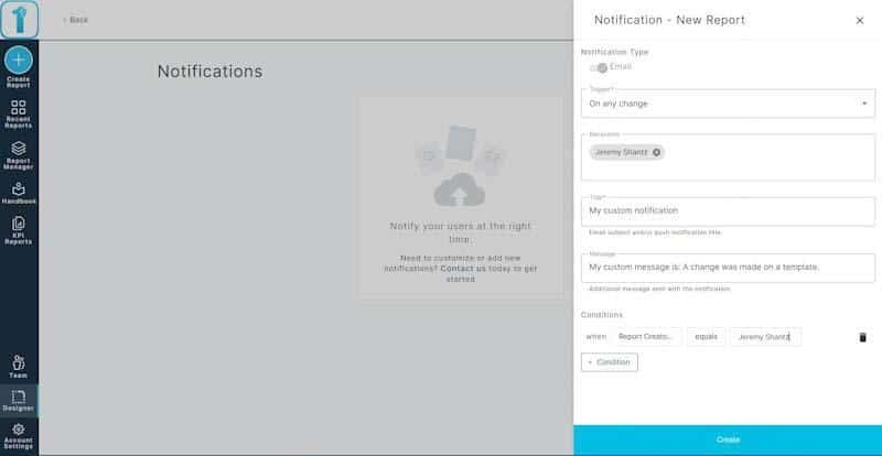
Now we’ll go ahead and set the other information like conditions, custom notification name, and message.
When you’re all set, click on the large blue Create button at the bottom of your custom notification window on the right.
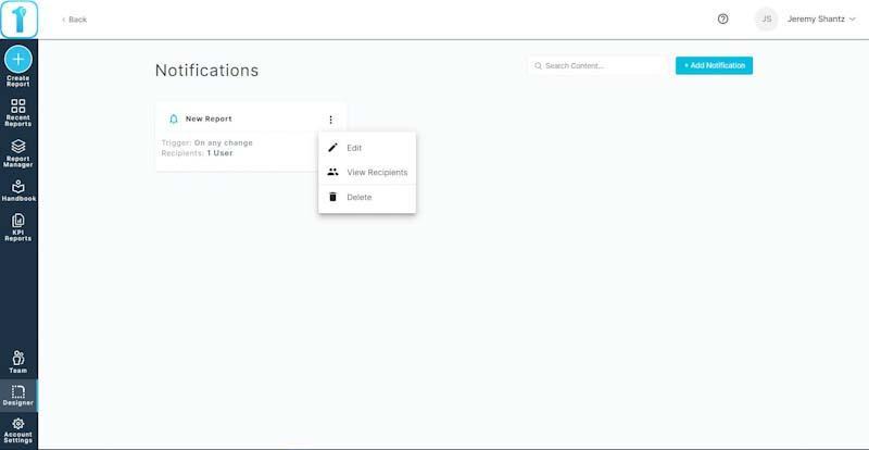
After creating your custom notification, you’ll be returned to the notifications management screen, where you’ll see the notification you just created. Again, you’ll have three options for the notifications: edit, view recipients, and delete.
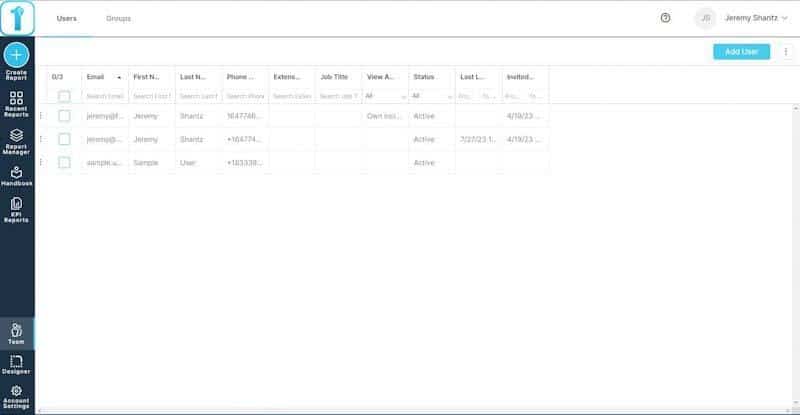
Of course, if you don’t have all your team members in the app to set the notification, you can easily add them via the Teams selector in the extreme left side menu; it’s just above the Designer button. See the below screenshot of the user’s management screen where you can add users, edit profiles, and other features.
We’ve covered building a custom template, adding a notification, and even looking at user management. However, in case you want to learn how to make a custom report template on mobile, let’s take a quick walk-through below.
Mobile Template Building Walk-Through
If you don’t have the app already, go to Google Play or The Apple App Store and download and install it to your device. Don’t worry; it works on all devices (or 99.9% of them, at least).
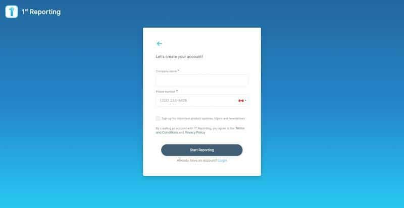
After installing the app, sign up for an account. Next, enable the GPS features by enabling location data on your device.
Once you’re in the app, you’ll be brought to your account dashboard, like the test account shown in the screenshot below. We’ll want to click on the Designer tab to create a custom report template.
After you click on Designer, you can choose between templates and lists. As we want to walk through creating a custom template, we’ll choose the Templates tab.
Once inside the templates tab, you’ll scroll through the prebuilt templates, as seen in the screenshot below. However, we’ll want to click on the big plus symbol in the top right corner to make a new custom template.
Again, we’re presented with three choices, as shown in the screenshot below. You can choose from our library of prebuilt solutions and modify them to suit your needs, create a new template from scratch, or upload a template. Our team of professionals will create your digital templates for you. In this example, we will walk you through creating a custom template from scratch; it will only take a few moments, so choose the ‘Build from scratch’ option.
Again, we’ll need to input a few formalities, like the name of the template we’re building and some visuals for the template, such as an icon and icon color. Furthermore, you can add a template description so your team members understand its intended use.
For our example, I’ve completed some of the information, which you can see in the screenshot below. Notice the time on my smartphone – we’re only a minute in and already naming our report; how’s that for efficient template creation? Not bad.
When you’ve included the preliminaries, click on the big blue Create button, as shown in the screenshot above.
Once you hit Create, you’ll be brought to the fields screen, where you can add fields to your mobile template. Just click on the big dark blue ‘Add Field’ button, as shown below.
As you can see in the below screenshot, I’m adding a text field for our example. I’ll get to name my field whatever I want. Furthermore, I can choose from multiple options. In this case, I’m choosing to turn on the required so that the end users will have no choice but to complete the text field, or the app won’t let them finish their report submission. It is a great feature to ensure your team doesn’t miss critical information when completing one of your reports in the field.
For the next example in the screenshot below, we’re adding a multiple-choice question to the report template. Again, we are faced with more customization options, like making the field required, allowing comments, enabling the ‘select-all’ feature, or even allowing user-defined options. There are even more advanced options, but we’ll stick to the basics for now.
You’ll want to take full advantage of great features in 1st, like the GPS functionality, as shown in the screenshot below. It’s easy to enable user location via GPS. That way, when a form is submitted, it shows on your report dashboard on a map. It’s a great feature for tracking report locations; perfect for multiple locations, field locations, remote sites, or multiple locations report tracking.
For example, in our desktop version of the 1st Reporting app, ensuring your team can include multimedia like photos or videos is easy. I’ve chosen the multimedia field in the custom report creator in the screenshot below. It allows you to name your multimedia field and all other fields via your smartphone’s built-in keyboard and typing options.
Once you have entered all your fields into your template, you should open the template creator main menu via the three dots in the upper right corner, as shown in the screenshot below. You’ll then have the option to edit details, preview the template, save a draft of the template, or publish the template.
As you can see below, I’ve chosen the Preview option to see what my team will see when they open the template on their mobile device. Notice that the time on my smartphone now shows 11:17. So, I’ve signed up, created a custom template, and previewed it in under 5 minutes. With lightning-fast features like this, you can deploy in minutes, not days or weeks.
Furthermore, getting back to our custom template, you’ll also notice in the screenshot below that multimedia does not limit your team to images alone.
Of course, to allow the app to include photos taken on the device, your team will have to enable permissions, as shown in the screenshot below.
Filling out your custom reports on a mobile device is easy for your team. With our public reporting options, you can even use the app to survey clients or the general public.
1st Reporting is one of the fastest, most convenient, and supercharged with just the right features to make it a perfect way for an organization to move into digital reporting. Suppose you have trouble with our app or want to request a demo for you and your team. In that case, our professionals are standing by, ready to help your organization go digital—the intelligent way—using 1st Reporting.

